
Command Palette

Search for a command to run...

CSS to ignore parent padding in 4 lines

Updated
2 min read
M

I have been a developer for a couple of years now, I write articles to help myself learn and help others on the way, and I believe this is the wisest decision I have taken so far.

I write articles on JavaScript, Web Development, Machine Learning, Self-Improvement, Blogging and Productivity.

Introduction

CSS is damn hard. It's these small problems that will take up your entire day and energy and the will to live. And one such notorious problem has been to make a child element break out of their parent's padding.

The problem

I recently tried to add a newsletter to my website (subscribe - shameless plug) and I wanted the form to extend to the side of the browser window, but there is a parent div with padding for getting that uniform look throughout the site.

how it looks with parent's padding -

1.png

how I wanted it to look -

image.png

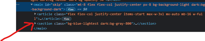
this happens because the section containing newsletter is within the main div -

3.png

Yeah I know, It sound's really simple and there are many janky solutions out there to fix it too. (The solution down below is more or less jank, but in relative terms, I believe it is really elegant 😁).

Solution

Give this below piece of CSS to the element you wish to break out(pun Intended).

.full-width {
  width: 100vw;
  margin-left: 50%;
  transform: translateX(-50%);
  max-width: 100%;
}

The max-width is required because otherwise, you may find a horizontal scrollbar.

yeah, It's that simple.

UPDATE: As I wanted the newsletter on every page I decided to move the section div one level up, so to the same level as the main. Hence, I don't have to do this hack.

A

Hm, I double checked your website, and it doesn't look like there is a padding on that newsletter div. Also, 100vw wouldn't work on desktop, as it counts 100vw with the scrollbar width. In case of padding your 100% would be width minus the padding.

Try it ;) add padding to the main div you have there and check if your CSS still works - plot twist, it doesn't.

CSS is weird and I give you that, just please please pretty please, double check your "tutorials" before spreading the tip, that's actually not working.

Smarter solution for this kind of case is using negative margins and having width with calc(100% + 2x your margin). Setting max width to 100vw would do the job on mobile devices tho, as there is no scroll space taken into an account when counting the viewport width.

M

Hello Angie, Thanks for pointing it out. I am really sorry for not explaining it properly.

The above code snippet indeed works fine, At the time of writing this particular article, the newsletter component was within the body tag, but after some time I thought it would be best to add the newsletter to all the pages and I decided to move the newsletter component to the same level as my main div(There is a container div for my entire website which wraps around the head, navbar, main and footer elements).

In doing so I was able to bypass the padding issue even without the above code snippet, as my main tag, the section containing the newsletter, all reside at the same level.

As I mentioned in the article. there are numerous ways to fix this small issue. Thanks for sharing yours. Also, by setting max-width: 100%; you won't have to worry about the scroll space.

A

Milind Soorya, still not a fix tho ;) Just try it, really.

Unless you're NOT* using box-sizing: border-box, your max-width: 100% will be 100% - the padding on the parent, meaning, the effect "before" and "after" is gonna be exactly the same.

I created a pen with your solution and mine underneath: https://codepen.io/Yzoja/pen/bGRvOjY

Added the scroll to main to make sure it works just as well when the scroll is visible.

*Not using box-sizing: border-box is fairly unsafe, because it means you have to count off every padding with elements set to 100% width. So, if you did it: don't.

More from this blog

M

Milind Soorya

27 posts

Hey 👋 I am Milind Soorya, a technology blogger from India. I love figuring out new technologies and publishing my findings. Hope this helps you.